
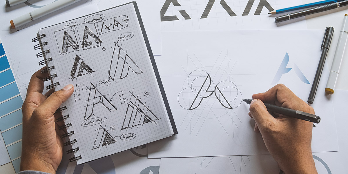
A dental practice’s identity can shape how people feel about it before they ever make contact. The way a practice looks and presents itself can influence first impressions, helping potential patients decide whether it feels professional, welcoming and trustworthy. A thoughtful design can help create that sense of confidence from the start.
The most effective designs help communicate the right message while creating a sense of familiarity that patients can connect with, which comes from understanding what makes a practice feel friendly and dependable, then turning those ideas into a design that feels simple and easy to remember. By choosing the right mix of clarity, character, and consistency, a dental logo can help build a connection with the people it is designed to serve.
Why a dental logo is more than just a visual identity
A dental logo can say a lot about a practice before a patient ever makes contact or has another sort of direct interaction with the team. Whether it’s seen on a website, sign, social media page, or appointment reminder, it helps shape those first impressions and gives people an idea of the type of experience they might expect.
For a healthcare brand, a logo needs to communicate feelings as well as information. It should reflect qualities that matter to patients, such as professionalism, care, cleanliness and expertise. When someone is choosing a dental practice, they are not only looking for the right services; they are also looking for somewhere they can feel confident and comfortable.
The strongest dental logo design brings together trust and approachability. They show that a practice is knowledgeable and reliable while still feeling welcoming and easy to connect with. This balance helps a logo support the relationship a practice wants to build with its patients from the very beginning.
The psychology of colour
Colour choices can have a big impact on the way people view a dental practice, and the colours used within a brand can influence how a patient feels before they even set foot in the building. The right palette can help create a sense of trust, calm, and reliability, while supporting the overall impression a practice wants to give.
Different colours are often connected with certain qualities in healthcare branding.
- Blue is often linked with trust, professionalism, and cleanliness. It can help a brand feel dependable, organised and reassuring.
- Green is commonly associated with health, wellness, and natural care. It can create a feeling of balance and a focus on patient comfort.
- White is connected with hygiene, simplicity, and precision. It can help a brand appear clean and carefully considered.
- Softer tones, like gentle neutrals and muted shades, can add warmth to a design, helping a practice feel more welcoming and approachable.
However, choosing familiar healthcare colours alone is not enough to create a memorable brand. If a palette feels too clinical or similar to many others in the local area, a dental practice may struggle to stand out. Colour choices should reflect the personality of the practice while also considering what will appeal to the people it wants to reach.
The most effective logo colours create a balance between professionalism and warmth. They should feel appropriate for the type of care being offered while also showing the character of the practice. Whether the aim is to feel modern, friendly, family-focused, or calming, the right colours can help create a brand that feels genuine and recognisable.
Typography and simplicity
The font used in a dental or healthcare logo design also gives the brand its personality and, just like colours, different types of fonts have their own meanings. Serif fonts are often linked with experience, heritage, and expertise, while sans-serif fonts tend to feel more modern, clean, and accessible. The best choice depends on the image a practice wants to create and the people it hopes to attract.
A logo should also be easy to read wherever it appears. Patients might see it on a website, outside the practice, on social media, or in printed materials, so it needs to stay clear in every setting. Choosing a font that is simple and legible helps make sure the logo always looks professional, no matter where it is used.
It can be tempting to add extra details in the hope of making a logo stand out, but this often has the opposite effect. Too many design elements can make a logo feel cluttered and distract from the message a practice wants to communicate, so keeping the design simple allows each part of the logo to work together more effectively.
The most memorable logos are often the simplest. They are easy to recognise and remember, and flexible enough to work across different platforms without losing their impact. A clear, well-balanced design is also more likely to remain relevant over time, giving a dental practice a logo that continues to support its brand for years to come.
| Font category | Example fonts | What is suggests | Ideal for |
| Sans-Serif | Arial, Verdana, Inter, Helvetica | Clean, modern, approachable, and transparent. Feels highly accessible and easy to digest | Digital health apps, patient portals, and general clinical websites |
| Serif | Georgia, Garamond, Times New Roman, Cambria | Traditional, established, credible and academic. Gives the impression of solid expertise and institutional reliability | Hospital branding, surgical centres, legacy practices, and specialist brochures |
| Geometric/high contrast | Futura, Century Gothic, Skeena, Montserrat | Aspirational, premium, and sophisticated. Projects elite care and innovation | Medical spas, cosmetic surgery and wellness centres |
| Rounded Sans-Serif | Arial Rounded MT Bold, Calibri, Nunito Sans, Segoe UI | Friendly, safe, and calming. Visually reduces anxiety and builds warmth | Mental health practices, paediatric clinics, and family dentistry |
Building a brand identity that patients trust
A logo is an important part of a dental brand, but it works best when it reflects the rest of the practice’s branding. The experience patients have, the way the team communicates, and the values the practice stands for should all feel connected, as when everything works together, the brand feels more genuine and leaves a stronger impression.
Consistency is a big part of building trust. Patients should see the same style across the website, social media, practice interiors, patient communications and advertising. When every part of the brand feels familiar, it creates a more polished and professional experience, helping people recognise the practice wherever they come across it.
Every dental practice is different, and its branding should show that. Some practices want to give the impression that they are warm and family-friendly, while others focus on premium care, innovation, specialist treatments or a more personal approach. A clear and consistent brand identity helps communicate these qualities naturally, making it easier for patients to understand what makes the practice right for them.
Key principles for successful dental logos
A strong dental logo is not built around one feature. Instead, it comes from a series of thoughtful design choices that work well together. From the colours and typography to the overall style, every detail plays a part in creating a brand that feels professional, trustworthy and recognisable.
The best healthcare branding also balances expertise with empathy. Patients want to feel confident that they are in safe hands, but they also want a practice that feels welcoming and approachable. Keeping the patient at the heart of the design process helps create a logo that reflects both professionalism and care, rather than simply appealing to those within the practice.
When reviewing a dental logo, it helps to ask a few simple questions:
- Is it clear and easily recognisable?
- Does it feel trustworthy?
- Is it memorable?
- Does it reflect the personality and values of the practice?
- Does it work well across websites, social media, signage, and printed materials?
A logo that can confidently answer each of these questions is far more likely to support a strong brand and leave a positive, lasting impression on patients.
Designing dental brands that inspire confidence and connection
A dental brand is more than just a logo. It helps show patients who you are, what you value and the kind of experience they can expect. When your branding feels consistent and considered, it becomes easier to build recognition and trust.
At Click Finder, we create dental branding with purpose. We work with practices to develop designs that reflect their personality, support their goals and create a consistent experience across every touchpoint.
Whether you are starting a new practice or updating your existing brand, our graphic design team can help create a visual identity that feels professional, memorable and true to your practice.
FAQs
Should a dental logo include dental-related symbols?
Dental-related symbols can work well, but they are not the only way to create an effective logo. Some practices choose tooth or healthcare imagery to make their services clear, while others prefer a more subtle approach that reflects their personality. The best choice depends on what feels right overall.
A symbol should feel natural within the design rather than being added just because it is expected. A simpler logo can sometimes help a practice feel more unique and easier to remember. The main goal is to create a visual identity that feels suitable and helps people connect with it.
How can a new dental practice create a strong brand identity?
A new dental practice can build a strong brand identity by deciding what it wants people to know and feel about the practice. Taking time to define its values, personality and approach to care helps create a clear direction. This makes it easier to build a brand that feels genuine.
From the logo and website to signs and patient messages, every part of the practice should feel connected. A consistent style helps people recognise the brand and understand what the practice stands for. Over time, this familiarity can help create a stronger relationship with patients and make the practice feel more established.
What are the specific challenges of dental and healthcare logos and branding?
Dental logos and healthcare branding need to get the balance right between feeling professional and feeling welcoming. They should show that a practice is knowledgeable and reliable, while also helping patients feel comfortable. The design also needs to look clear and work well across websites, signs and other materials.
Creating something unique can be challenging because healthcare branding often needs to follow certain expectations. A practice needs to feel trustworthy without looking the same as every other provider. The strongest designs show the personality of the practice while keeping the patient experience at the heart of the brand.